
OnScreen.md 4.4 KB
On-screen Controls
You can use on-screen Controls to simulate Input Devices with UI widgets that the user interacts with on the screen. The most prominent example is the use of stick and button widgets on touchscreens to emulate a joystick or gamepad.
There are currently two Control types implemented out of the box: buttons and sticks. You can implement custom Controls by extending the base OnScreenControl class (see documentation on writing custom on screen Controls to learn more).
Note: On-screen Controls don't have a predefined visual representation. It's up to you to set up the visual aspect of a Control (for example, by adding a sprite or UI component to the GameObject). On-screen Controls take care of the interaction logic and of setting up and generating input from interactions.
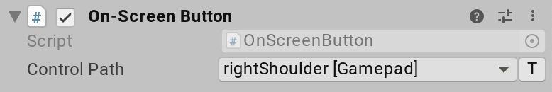
Each on-screen Control uses a Control path to reference the Control that it should report input as. For example, the following on-screen button reports input as the right shoulder button of a gamepad:
The collection of on-screen Controls present in a Scene forms one or more Input Devices. The Input System creates one Input Device for each distinct type of Device the Controls reference. For example, if one on-screen button references <Gamepad>/buttonSouth and another on-screen button references <Keyboard>/a, the Input System creates both a Gamepad and a Keyboard. This happens automatically when the components are enabled. When disabled, the Input System automatically removes the Devices again.
To query the Control (and, implicitly, the Device) that an on-screen Control feeds into, you can use the OnScreenControl.control property.
Note: This design allows you to use on-screen Controls to create input for arbitrary Input Devices, in addition to joysticks and gamepads.
On-screen buttons
The OnScreenButton component requires the target Control to be a Button Control. OnScreenButton sets the target Control value to 1 when it receives a pointer-down (IPointerDownHandler.OnPointerDown) event, or 0 when it receives a pointer-up (IPointerUpHandler.OnPointerUp) event.
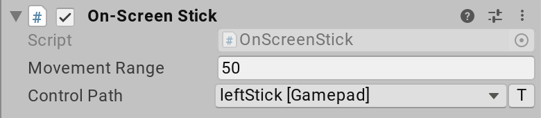
On-screen sticks
The OnScreenStick component requires the target Control to be a Vector2 Control. OnScreenStick starts the movement of the stick Control when it receives a pointer-down (IPointerDownHandler.OnPointerDown) event, and stops it when it receives a pointer-up (IPointerUpHandler.OnPointerUp) event.
In-between, the stick moves according to the pointer being dragged (IDragHandler.OnDrag) within a box centered on the pointer-down screen point, and with an edge length defined in the component's Movement Range property. A movement range of 50, for example, means that the stick's on-screen area is 25 pixels up, down, left, and right of the pointer-down point on screen.
Writing custom on-screen Controls
You can add support for new types of Input Controls by extending OnScreenControl. An easy example to follow is OnScreenButton.
    [AddComponentMenu("Input/On-Screen Button")]
    public class OnScreenButton : OnScreenControl, IPointerDownHandler, IPointerUpHandler
    {
        public void OnPointerUp(PointerEventData data)
        {
            SendValueToControl(0.0f);
        }

        public void OnPointerDown(PointerEventData data)
        {
            SendValueToControl(1.0f);
        }

        [InputControl(layout = "Button")]
        [SerializeField]
        private string m_ControlPath;

        protected override string controlPathInternal
        {
            get => m_ControlPath;
            set => m_ControlPath = value;
        }
    }